← Back
Increasing Conversions With Better Experiences
My Role
Principal Product Designer (2016 - 2020)
Worked with PM, Engineering & Growth teams, and the Founder at Poached Jobs
Skills Used
Product Strategy, A/B Testing, Qualitative & Quantitative Research, Interaction Design, Prototyping, Mobile Design, Visual Design, Data, KPIs
Summary
I redesigned customer onboarding, checkout, and other workflows using data to reduce friction in the job application process—improving the conversion rate by 59%. These design changes had a direct impact on revenue, acquisition, retention, and satisfaction.
Customer Onboarding
My Role
Principal Product Designer (2016 - 2020)
Worked with PM, Engineering & Growth teams, and the Founder at Poached Jobs
Skills Used
Product Strategy, A/B Testing, Qualitative & Quantitative Research, Interaction Design, Prototyping, Mobile Design, Visual Design, Data, KPIs
Summary
I redesigned customer onboarding, checkout, and other workflows using data to reduce friction in the job application process—improving the conversion rate by 59%. These design changes had a direct impact on revenue, acquisition, retention, and satisfaction.
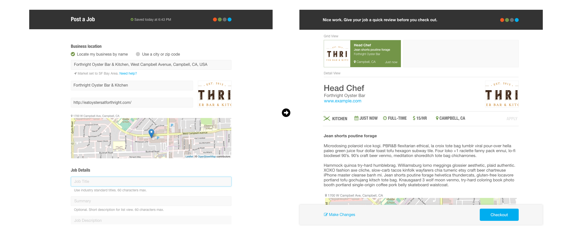
The onboarding experience was poor and purchase conversions were low for new users. I designed new onboarding screens to help customers post their first job.
Outcome
39% increase in customers onboarded (successfully posted their first job)
Insight
We tested pre-populating the business location when posting a job, which decreased conversions. I realized this is because restaurants often have more than one location.
Before - The post-a-job flow had too many distractions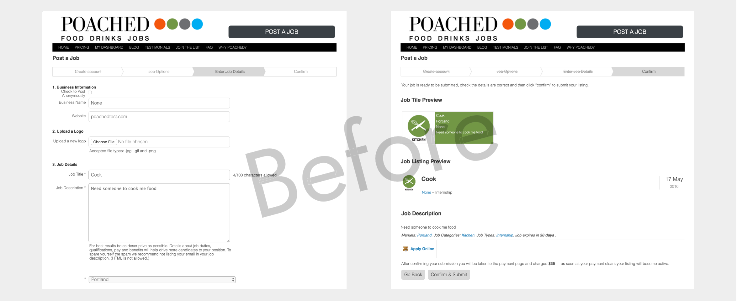
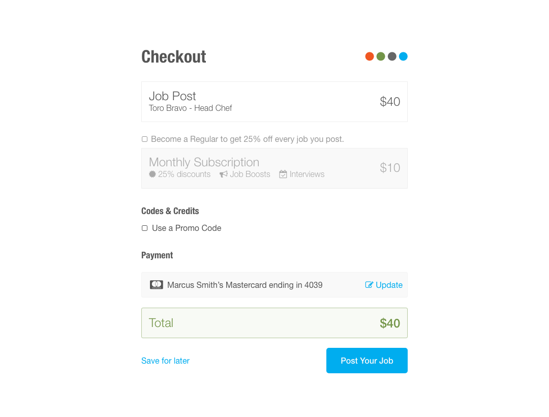
Checkout
I redesigned the checkout screen to incorporate new features, reduce distractions, and provide a more enjoyable checkout experience.
Results
6% increase in purchases
Insight
When customers have made it this far, they’re pretty determined. The existing checkout screen was quite bad but still converted well.
Before - The CTA is hard to find, but customers managed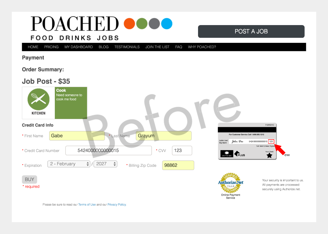 After - Full screen modal with no distractions
A/B Testing for Revenue
We wanted to encourage customers to promote their jobs, which drives revenue and generally helps them hire faster. I designed several variations which we used to conduct a series of A/B tests.
Results
In the third variation, I introduced new copy focused on the benefits of boosting. This version converted 50% better than the control.
Insight
Our first variation decreased conversions (and revenue) by introducing an extra decision point. For the second variation, I tried a simpler approach that ran even with the control.
Control (left) vs Winner (3rd variation)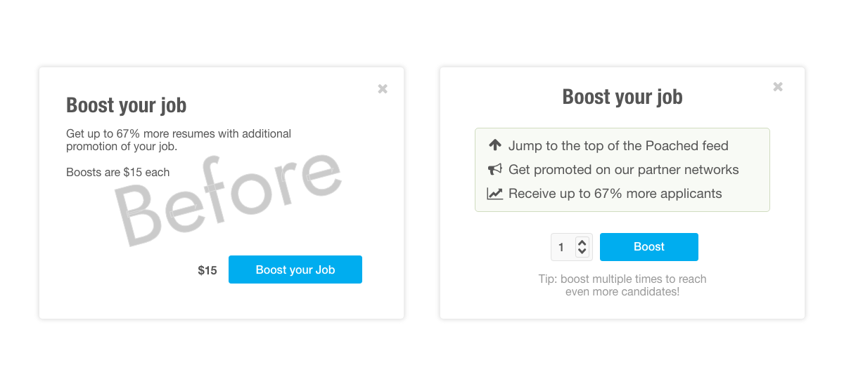
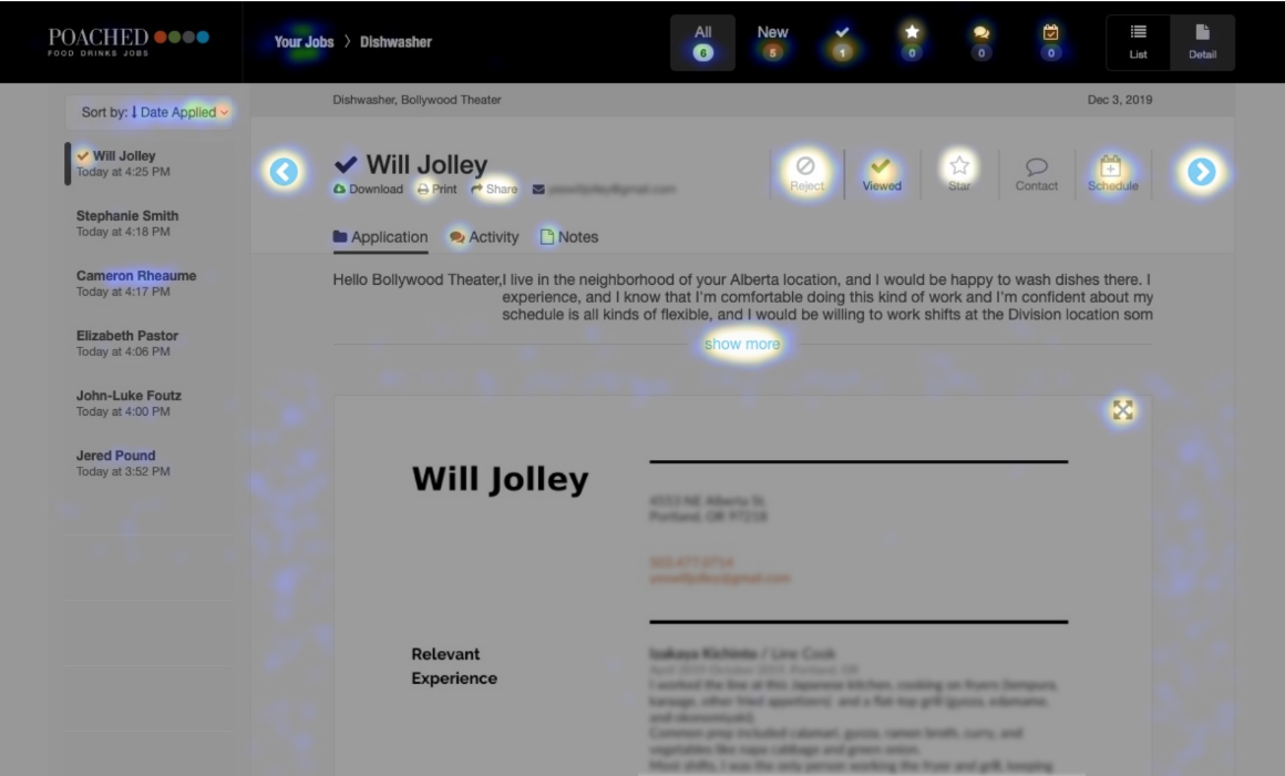
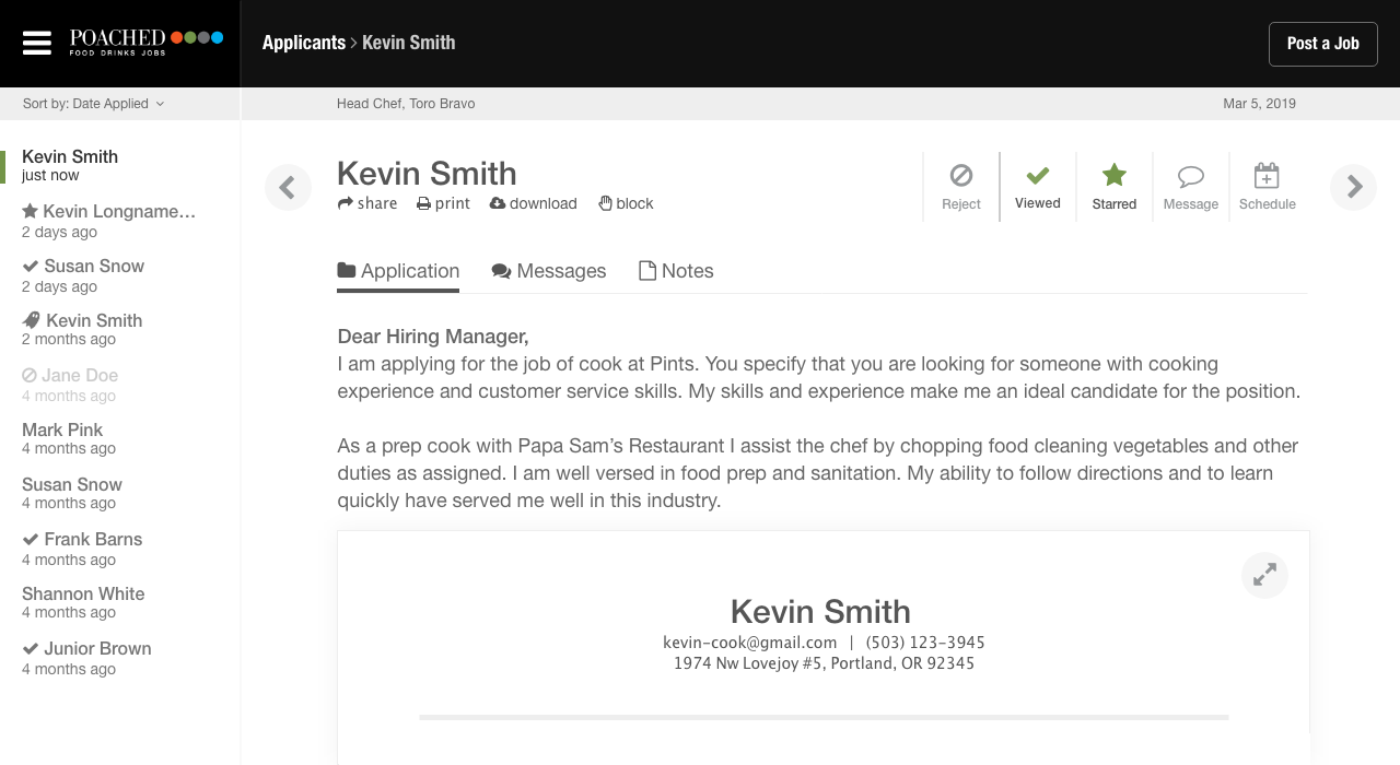
Evaluating Applicants
I redesigned the core screen customers use to evaluate applicants and validated the design through user testing. Once we released the new design I ran a heatmap to see usage patterns and collected customer feedback.
Results
Customers reported that evaluating applicants was easier. No significant usability issues were found in the shipped design.
Insight
The heatmap showed that the most-clicked item was the cover letter. I ran a distribution of cover letters by length and revised the screen so that most cover letters would be fully visible.
My first version of the design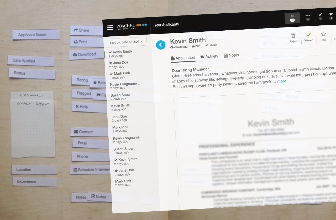 Testing usage patterns in production
 The optimized design after testing
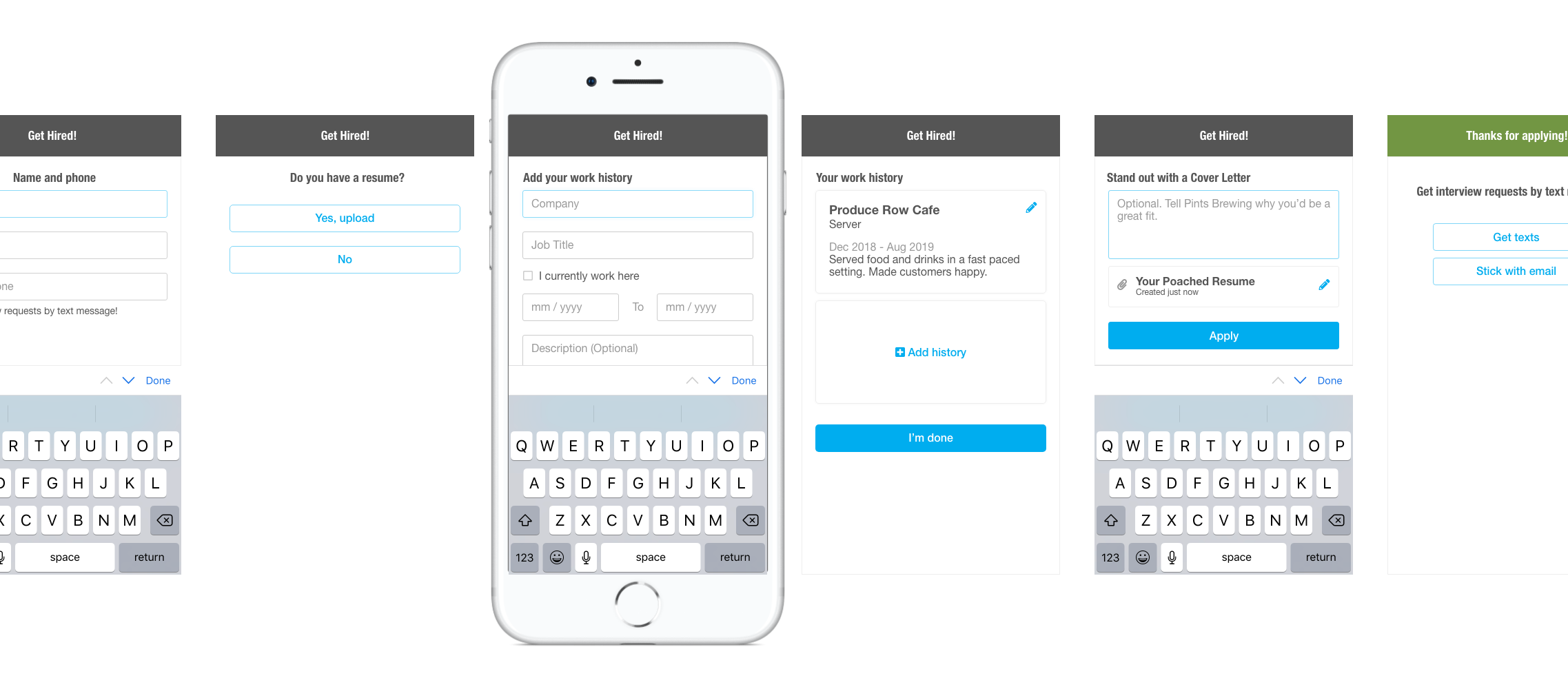
Applying for a Job
I used analytics data to determine the lowest-performing segment in the job application process (mobile users without a resume). I designed a new set of screens to capture the applicant’s work history in bite-sized pieces.
Results
Increased the conversion rate by 59%
Insight
We tried a similar test on customers when they post their job via mobile, with opposite results. Solutions are not universal.
Before - The resume process looked overwhelming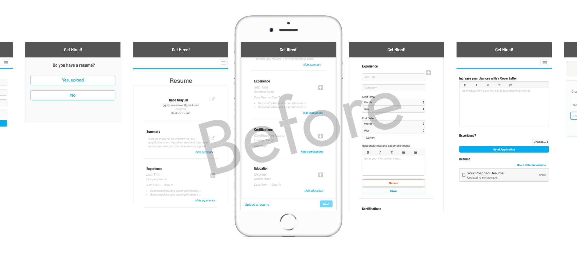
← Back